How to Read the Maps
The following maps have been generated for each species, accessible by clicking on the name of the species:- Current suitable habitat maps
- PCM climate model maps (A1 and B1 scenarios for 2050 and 2100)
- Hadley climate model maps (A1 and B1 scenarios for 2050 and 2100)
- Minimum required movement (MRM) maps
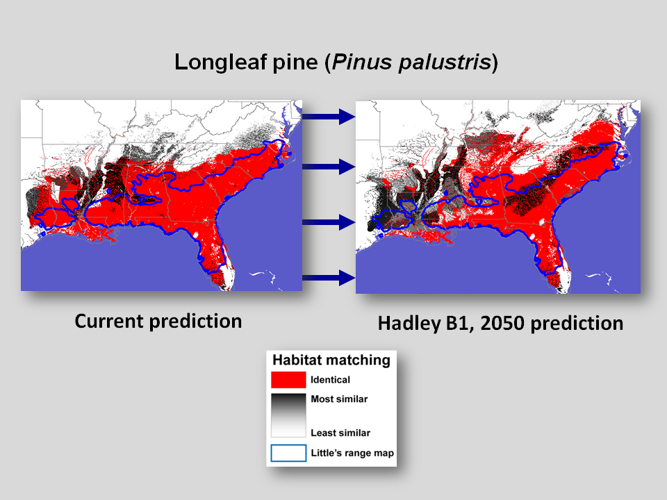
On the current suitable habitat maps and future habitat maps (PCM climate model maps and Hadley climate model maps, under two emissions scenarios at 2050 and 2100), areas that are red are statistically identical to locations where the species is known to currently exist. Areas in gray are similar to existing locations, with darker gray areas most similar and lighter gray areas less similar.

The differences between the existing distribution for each species in current time (the blue outlines on the map) and the predicted habitat in current time (in red) are not unexpected: Existing environmentally suitable habitat for a species (its fundamental ecological niche) will almost always be broader than its actual distribution (its realized fundamental niche) because of inter-species interactions and biogeographical history, among other reasons.
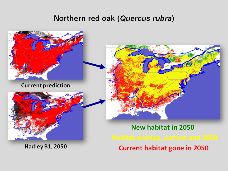
Another set of maps reports the minimum required movement (MRM) for the species to match anticipated changing climate conditions. The first of these maps (labeled "Present and Future Ranges - Hadley, Scenario B1, 2050") compares the current expected range to the range in 2050 under the Hadley model, lower emissions (B1) scenario. On these, yellow areas are those that are currently suitable and expected to be suitable in the future, green areas are those expected to become suitable in the future, and red areas are currently suitable habitat areas that are expected to become unsuitable.

The second MRM map for each species is a cost map for the world depicting the direction organisms would need to move to reach suitable habitat in the future (labeled "MRM Distance Cost - Hadley, Scenario B1, 2050"). This is used to generate the following two maps. In these maps (labeled "MRM Direction Map - Hadley, Scenario B1, 2050"), the green areas are future suitable habitat (whether new or existing in current time), while peaks and valleys are generated to depict the direction from currently suitable/future unsuitable habitat to the nearest suitable habitat in the future.
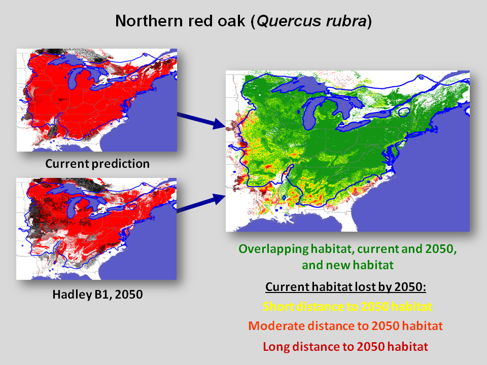
The last MRM maps (labeled "MRM Distance Map - Hadley, Scenario B1, 2050") show the distance from current suitable habitat to future suitable habitat. Green areas are, as with the direction maps, areas that are suitable in the future, both newly suitable habitat and habitat that remains suitable over time. Current suitable habitat that is expected to become unsuitable is displayed in a color ramp from yellow to red, with darker areas being farther from suitable habitat in the future.


